

Multimodal projects give students the opportunity to express themselves on a platform that fosters creativity and uniqueness. There are also so many ways to utilize multimodal projects, anywhere from a quick in class exercise to a unit long composition process, the opportunities are endless.
I did a short and simple infographic on the importance of plant awareness. I went back and forth on whether to do an ‘English content’ related infographic or not, and I ended on plant life since I used to spend far too much time slathering on calamine lotion after being under educated on what plants I should avoid, and I think it is a simple but often neglected lesson for anyone who spends time outdoors.
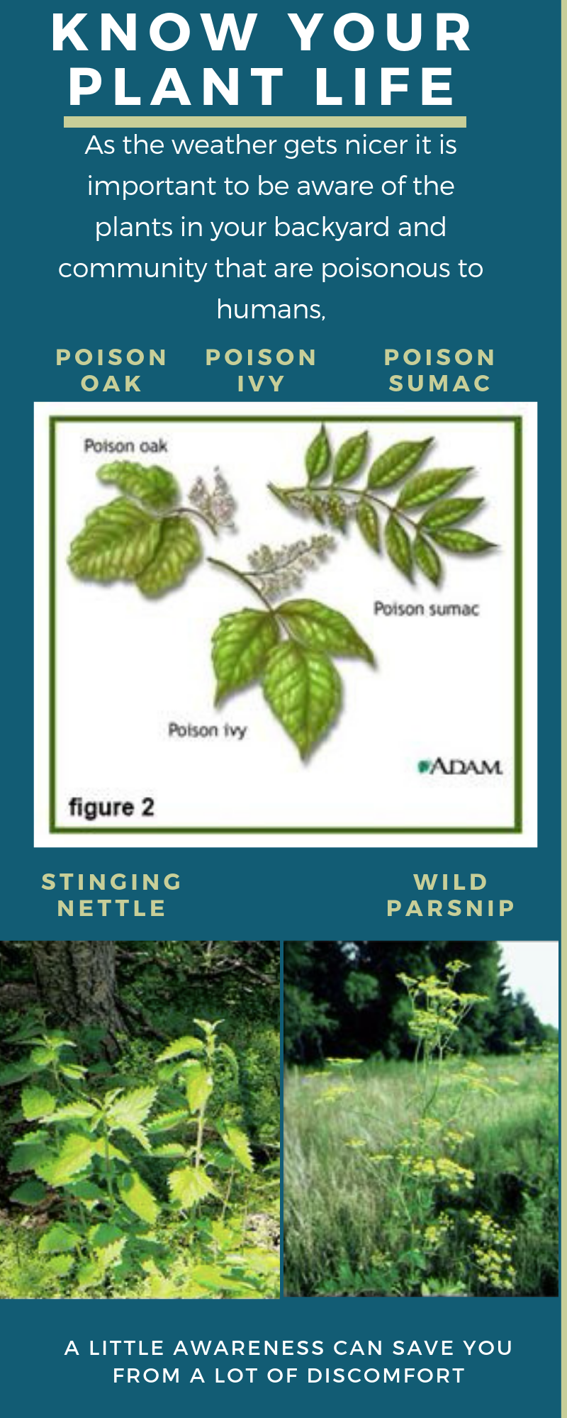
I didn’t incorporate any audio or video, but I felt that for the purpose of my intended message the pictures were more than adequate. People often recognize the names of poisonous plants but not the actual plant, so for this particular use, the pictures are almost more important than the words. When finding images I had to pick ones that depicted the plants I wanted to use in a clear way. I made the choice to include poison sumac only because that was the best image I could find that clearly compared poison oak and poison ivy, the others were either too blurry or too big to fit on my project. And while poison sumac is only found in certain ecosystems in Wisconsin, such as the Cedarburg Bog and similar permanent wetlands, I felt it was worth adding to the infographic for use of the image itself since the other two are so commonly found.
I struggled with sizing, I wanted the overall infographic template to be bigger, but I couldn’t figure out how to increase the size on the platform I was using (I don’t think you could change template sizes), so I had to work with what I had. And in order to do so I had to choose what I thought was the most common and easily avoidable poisonous plants-since there are many more in Wisconsin. I also had a hard time figuring out how to size the images, I didn’t want them to be too big that they seemed to take up the whole infographic, but I wanted them to be big enough to at least be able to identify the plants. So throughout my process it was a lot of resizing and moving of text and images. I also was aware of color choices, which seems like an unimportant or mundane thing, but since I didn’t want to take away from the text by choosing clashing or uneasy to read colors I had to be conscientious of these choices.
Through this seemingly simple process I was able to prioritize, experiment, and even just educate myself on the platform I was using. It also gave me a better idea of what exactly an infographic is and to focus on important information rather than overloading information so it isn’t cluttered or loses the focus of the ‘big idea’.
Originally I had this idea in my head that infographics were used to show statistics or comparisons, but then I read in the article What is an Infographic? that you should use infographics “when you need to give someone a really quick rundown on something that can be hard to explain in words alone” (Midori Nediger). Which is why I felt that something that NEEDS visuals, like poisonous plants, would be a good use of an infographic.
Infographics or any multimodal composition can teach students to use resources appropriately, build organization skills, learn how to prioritize, and can even give them a way to address a community or societal issue in a way that doesn’t directly link them to it-if they would prefer to stay anonymous. These platforms can give students a place to find their voice aside from academic papers and formal projects.

Hi Melissa,
I thought your infographic was very informative and easy-to-follow, as the article you cited encourages. I also agree, that infographics can be used as great tools to foster more removed, factual discussions of social/political issues; they can also serve as fresh, creative tools for presenting information in a visually appealing way that extends the words beyond direct statements. Thanks for sharing.
LikeLike
Wow, this is a really good way to get a lot of information. I’ve been having trouble not knowing how to proceed, but you’ve helped me out. The way that you put forth your awareness makes me really want to get out there even more and have fun exploring and protecting. Good job on your multimodal.
LikeLike
Hey Melissa,
This is a great example of how infographics allow you to condense a lot of information into few words using informative visuals! I really like how you keep it simple, allowing the pictures to speak for themselves. As we talked about, the most important part of this information is knowing what the plants looks like!
LikeLike
Pingback: Blogging Reflection – Exploring Digital Literacy